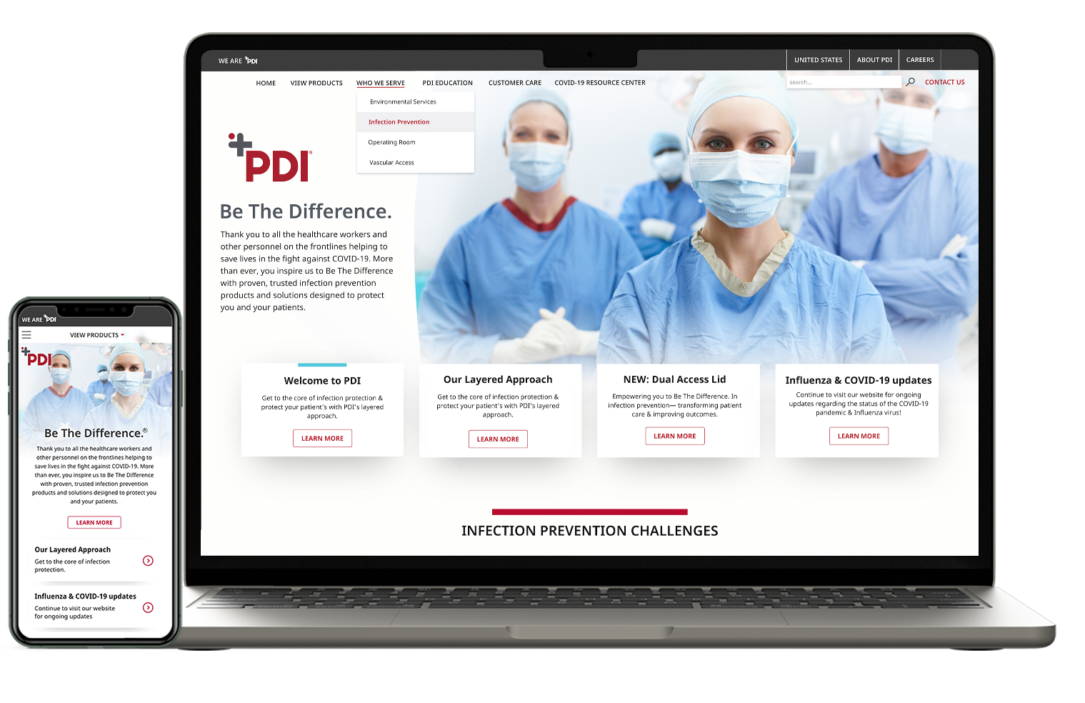
PDI Healthcare is a leading company in infection prevention and aims to protect healthcare workers, patients and their families with evidence-based, market leading infection prevention products and solutions.
PDI HEALTHCARE
TASKS
UX/UI Design
Responsive Design
Research
TIMELINE
2022-2023
TEAM
Barb Monzo (PM)
Domenick D’Agostino (Dev)
Jillian Maisano (PDI Marketing Lead)
PDI has been a longstanding name in healthcare infection prevention products. They aim to not only provide quality products but strive to present research findings and continuing education resources to those in the industry.
Overview
Jillian, the marketing manager from PDI requested a re-design of the PDI website starting with the home page. Working with an already established brand guideline, the idea was to enhance the usability while offering a fresher, modern look and feel. After a steady decrease in traffic the outcome was to enhance user engagement, increasing conversion rates, and sales. Jillian and her team had a strong understanding of the user base and was able to guide on the strengths and weaknesses.
Goal
As the lead designer for the website revamping project, my responsibility was to create design solutions for the website while following the branding guidelines. Screens were designed for both web and mobile.
With my team's support, we revamped most of the key pages that includes
Homepage
Find My Rep page
How to Buy page
Who We Serve page
Scope
PDIHC.com focuses on their products, who they serve, and educational information however, they are not (currently) an e-commerce site. Despite wanting to highlight their products, they equally wanted to promote the information accompanied their products and their mission. The question was seemingly simple: how can we achieve that? How can we promote our content in a way that is clear and actionable, while ensuring the user can easily understand how to buy their products, if that is their goal.
Considerations:
Project Kickoff
My team and I met with PDI to discuss the logistics of the project and their end goals. We kicked off with reviewing digital analytics to better understand where there was room for improvement. PDI was looking to update the user experience and interface of their current homepage to help increase engagement and this data helped give us a visual representation.
Discovering user
analytics
Visitor engagement was seeing a steady decrease over time.
A scroll and click map provided insight on how users were interacting with the original home page. This info allowed me to spot opportunities for user experience improvements, and helped me understand where changes were necessary to achieve the eventual end goal— which was to increase conversions.
Wireframing
The client requested removing existing areas but also had new information they wanted to design for. Being that some content was considered more important, we wanted to keep that for the more viewed and therefore desirable real estate of the page.
Wire framing helped me organize and visualize where the current content and the new content would live on the page.
Focal Point
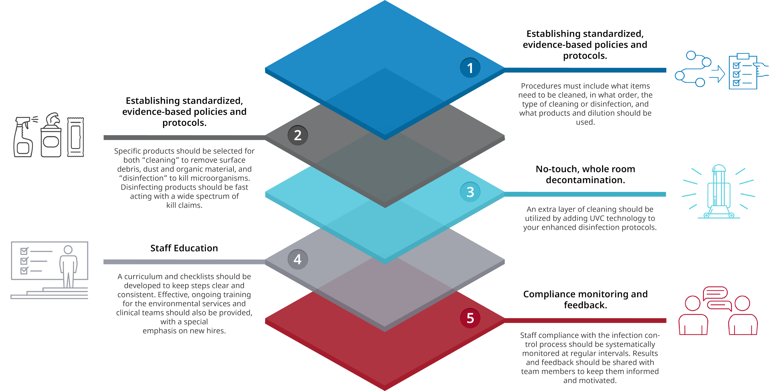
One particular requirement was to include a graphic displaying their Layered Approach which was a diagram depicting their ideology that: “Hospitals need multiple layers of defense to ensure the highest level of cleanliness because no single approach can completely eliminate microorganisms in the environment.”
Since the ‘Layered Approach’ philosophy was so ingrained in PDI’s values, it was important that the infographic design be eye-catching and interactive. As a result, there were several iterations done before getting to the final design.
Reference for design
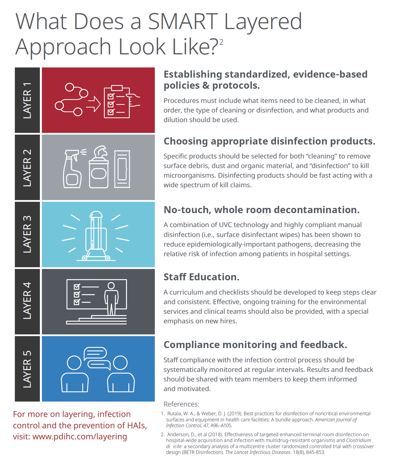
I was provided a reference PDF that was being used within the resource section on the PDI website.
My goal was to emphasize the layered approach visual while inlcuding the icons and information that correlated with each.
The first option incorporated a layered visual that was inspired by the shape of a pathogen, nodding to their infection prevention goals.
OPTION 1
OPTION 2
The second option was a more literal layered visual with a texture nodding to one of their top products (Sani-Cloth wipes)
‘Layered Approach’ final design
This video provides a visual into the infographic interaction and function
HP Design Options
Overall the general direction was well received, however there were specific details and modules from each design that the client really loved. A few details of the feedback included using more blue and less red, reducing the amount of curved lines and eliminating some of the extra imagery.
Final Design


