TESS YOGA APP
Tess, a yoga teacher with a large online audience is in need of a personal app designed to migrate users from Youtube and Instagram.
TASKS
UX UI Design
Research
Prototyping
Usability Testing
Project Management
TIMELINE
Aug 2020-Dec 2020


As the sole designer working on a freelance project, I was responsible for research, analysis, design, prototyping, testing and hand off.
Overview
Goal
Tess is a yoga teacher that began her career when she started uploading lesson videos to her YouTube channel. After building a following, and to accommodate demand, she opted to create her own app.
Create a simple and user-friendly platform to share with her existing clients, while aiming to gain new client subscriptions. Priorities included intuitive navigation, high res video functions, scheduling abilities, and tracking user stats.
Scope
Research
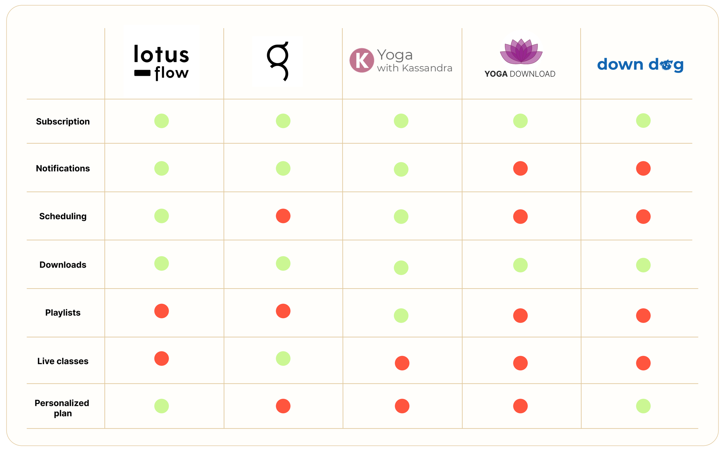
I did a competitive analysis to compare similar apps based on functionality and prominent features to better understand the competition of other yoga apps available. Being that there were a lot to choose from, I selected a chosen few ranging from those with high user engagement/popularity to smaller, less reviewed ones.
Must needs from the client included scheduling and video downloads. After discussing, we decided to include a notification feature, to keep the users updated on new classes and news in general. I suggested adding a curation of playlists. I wanted to the user to be able to filter out class styles in a playlist format so they could easily follow along with a specific type of yoga.
Style Guide
The client was heavily focused on the overall look and feel and was particular with what she was envisioning— which was a “soft, airy, relaxing and feminine, but not too feminine” aesthetic. Her clientele was largely made up of women. Ultimately my goal was to abide by her wishes, while still keeping in mind inclusivity, as it’s important to cater to a wider audience. The end goal is user engagement and the best design approach to encourage that.
I first curated a mood board and then based on that, chose the main color palette, font combination and then created a custom logo for the app.
Color psychology states that both colors blue and pink provide a sense of calm. That calmness brings feelings of relaxation and contentment, which is essential in yoga! These two colors also lend well together to provide a balance between masculine and feminine.
How did I make these final choices?
Site Map
A site map helps provide insight on the overall content and structure. Here we can visualize a representation of high level, mid level and sub level functions within the app.
Wireframes
Wireframing is an essential part of the process because they help provide a clear overview of the layout, page structure, functionality, and intended behaviors.
Iteration at this stage is inevitable, and having a visual guide to be able to work out any kinks is crucial before spending time on extending the UI design across the screens. I used these to help with testing the flows, collecting feedback, and amending where necessary.

Hi-fi screens
Once all of the iterations were ironed out in the wireframe phase, I proceeded with extending the visuals to create the final screens. Check out the Figma prototype below to see more of the final product!


